

By Tracie Eaton, Artist and Colour Consultant
Colour is often the first thing we feel when we enter a room, even before we consciously notice it. It draws us in, directs our attention or brings a sense of cohesion to a space. Yet choosing colour can also be one of the most challenging parts of the design process.
As an artist and colour consultant, I encourage designers to desgin with intent, to think beyond individual paint colours and consider not only the relationships between them but the impact they have on the people who interact with that space.
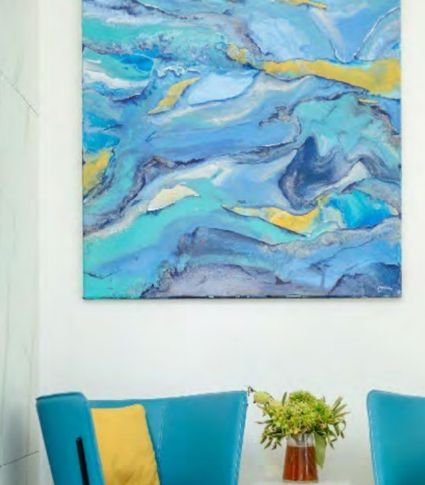
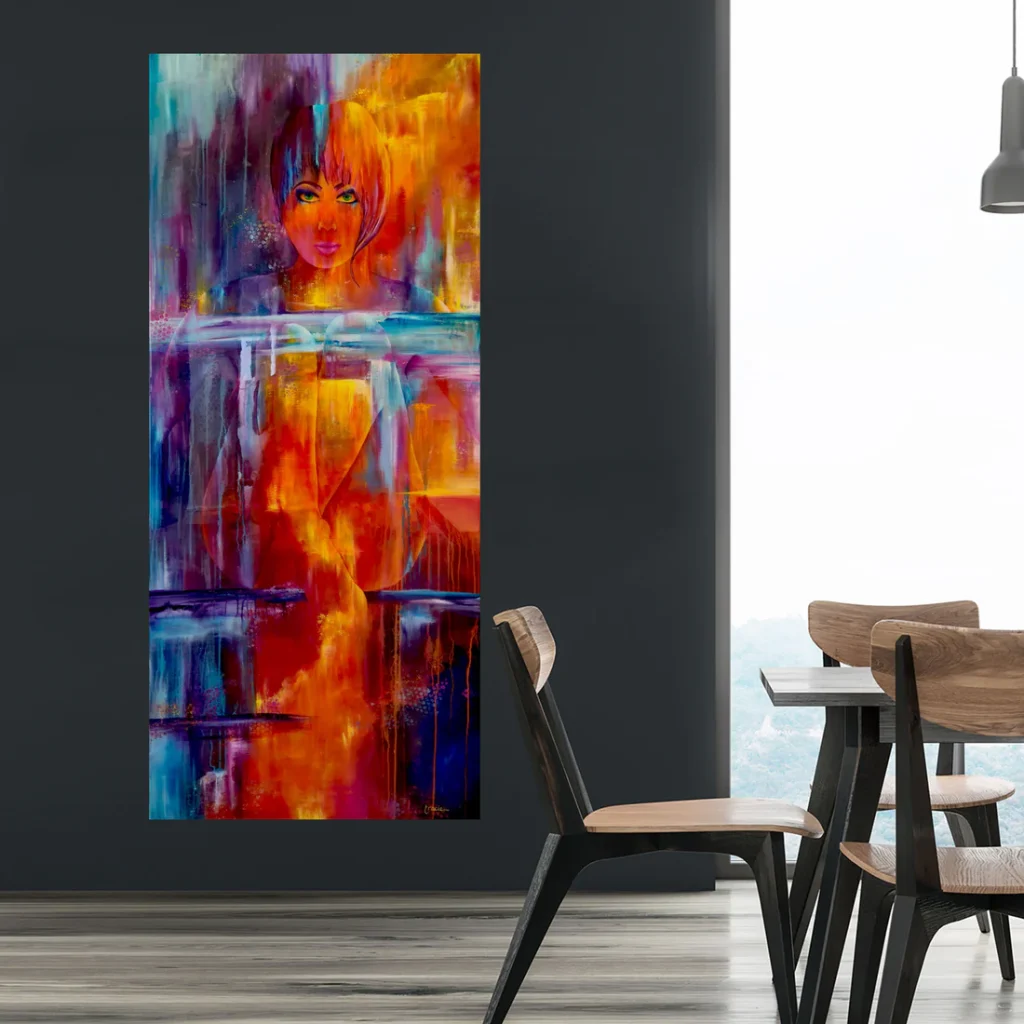
Here are some quick steps to consider:
Start with the feeling, then build the palette
Before reaching for a colour chart, establish what the room needs to support. Is it a place to retreat, connect, concentrate or entertain?
Use that intention to guide your choices, while allowing for personal associations. A blue that feels restful to one client may feel cold to another. Ask clients which spaces they enjoy spending time in, what colours they like and feel comfortable with and what they would prefer to avoid.
Those conversations are often more revealing than asking for a favourite colour.
Read the colours already in the room
Few interiors begin with a blank canvas. Flooring, stone, timber, joinery and existing furnishings all contribute colour, even when they appear neutral.
Look closely at their undertones. A grey tile might lean towards blue, green or violet. A seemingly white benchtop may have a creamy background that becomes more apparent beside a crisp white cabinet.
Gather these finishes together before selecting paint. Your palette should respond to the room’s permanent elements, helping them feel intentional and connected.
Let light have a say
A colour sample is a starting point, rather than a guarantee of how a finished room will look.
Test generous samples vertically and move them around the space. Review them in morning light, later in the day and under the artificial lighting that will actually be used.
Look for textures within the space. Textures cast shadows, adjusting how the light plays with the colour you are reviewing.
In Australian homes, north-facing rooms generally receive more direct sunlight, while south-facing rooms often have cooler, less direct light. Surrounding buildings, vegetation, glazing and window coverings can change that picture considerably. Always trust what you observe on site.
Give each colour a role
A successful palette benefits from a clear hierarchy. Decide which colour will create the overall atmosphere, which will provide support and where you want contrast.
Proportion matters as much as the colour itself. A deep burgundy cushion offers a small punctuation mark; burgundy walls create an entirely different experience.
Use palette ratios as a starting framework if helpful, but avoid treating them as a formula. Judge the balance across the whole room, including furniture, flooring, artwork and views beyond the windows.
Use contrast to guide the eye
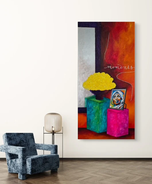
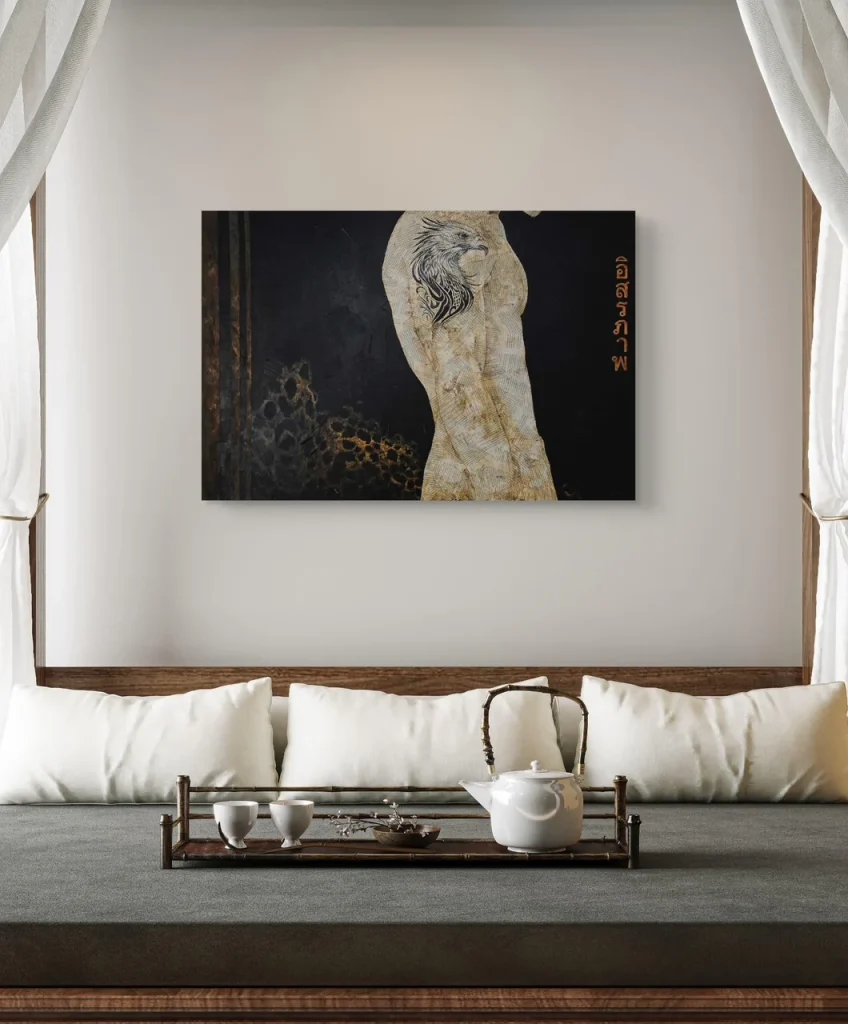
Contrast is not limited to combining different hues. Light against dark, muted against vivid, and matt against reflective surfaces can all create interest.
In a quiet palette, subtle changes in tone and texture can prevent the room from feeling flat. In a more expressive interior, areas of visual rest allow stronger colours to retain their impact.
Consider where you want the eye to land first, and make sure competing elements do not dilute that focal point.
Bring artwork into the conversation early
Art can provide a rich starting point for a palette, particularly when it already holds meaning for the client.
Look beyond the artwork’s most obvious colour. A small passage of olive, clay or soft pink might offer a useful connection to upholstery, joinery or accessories.
Avoid matching every element to the painting. Allow the artwork its own presence, with the interior supporting its mood, depth or contrast.
Think beyond the individual room
Check how colours relate as people move through the interior. Doorways and adjoining rooms create framed views, bringing separate palettes into the same visual field.
Repeating an undertone, material or accent can establish continuity without making every room identical.
Ultimately, confident use of colour for intentional design begins with understanding the people who use the space, along with observation. Listen to the client, understand the colours that work together to create the emotional response required, study the light and test materials together.
The most successful spaces have a clear purpose, an intentional palette and enough personality to ensure the space feels the way the people it belongs to want it to.
Want to know more, contact me anytime: Tracie Eaton, tracie@tracieeaton.com 0406 64 9720